What is an index curve in crop yield modeling?
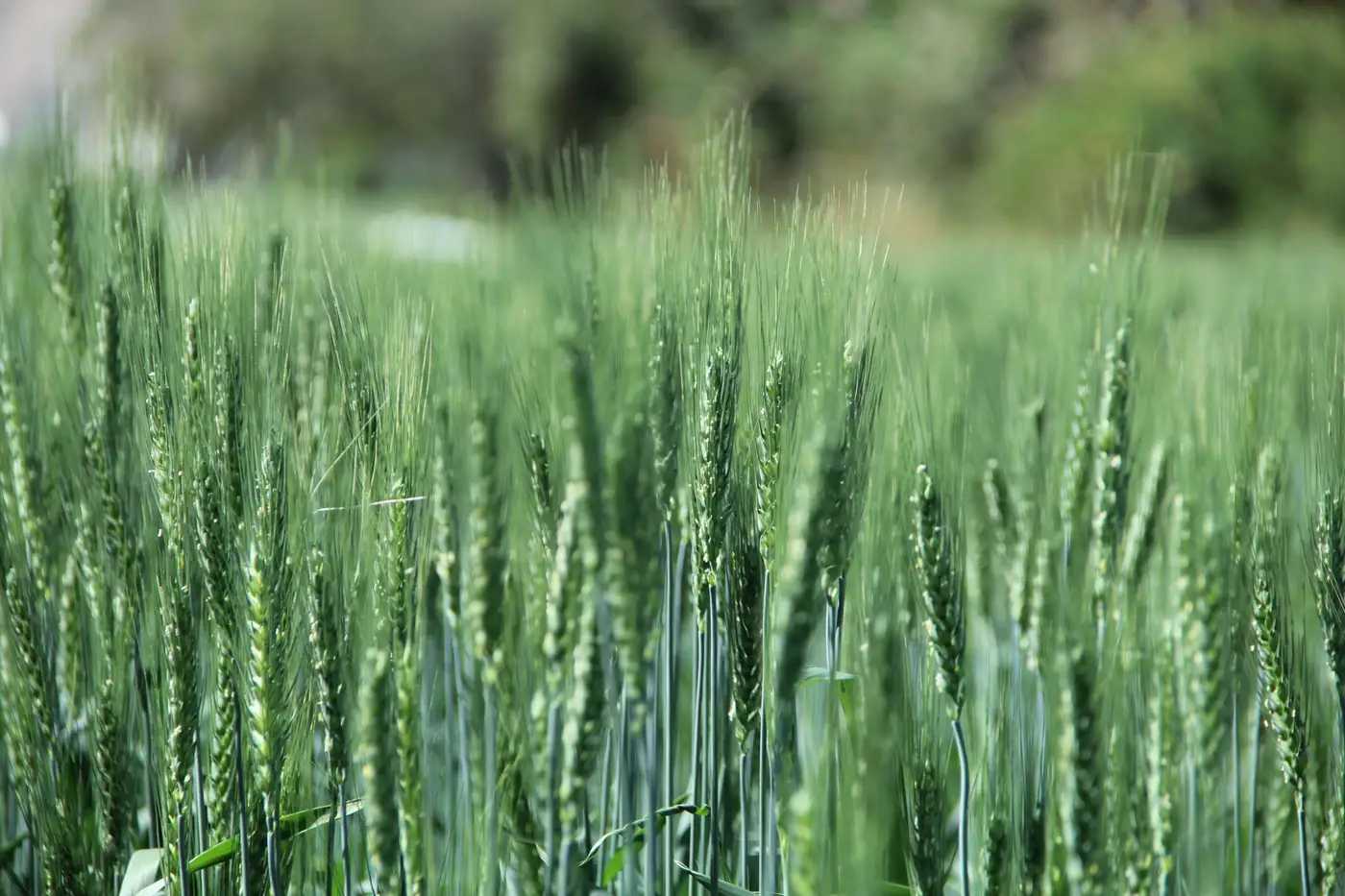
An index curve is just the plot of a vegetation index, usually NDVI or something close to it, tracked through the growing season for a given region. Green-up on one end, senescence on the other, a hump somewhere in the middle. Nothing mysterious about the shape itself. The work is in what you do with it once you've got a few years stacked up.
Every crop year produces its own curve. A wet spring pushes green-up earlier and the hump higher. A dry July flattens it out before grain fill finishes. Stack five or ten years of these curves for the same region and you've got a baseline, the range of shapes that region tends to produce, and where the current year's curve sits inside that range on any given week.
How the curve gets built
The index itself comes off wide-swath multispectral passes, the kind of coverage that can sweep a whole county or crop district rather than a single field. Each pass gives you one point on the curve for that region, that week. String the points together across the season and you've got a running line instead of a single snapshot.
The modeling step is a regression: this year's curve shape, measured in slices as the season progresses, against the historical yield outcomes tied to curves that looked similar in past years. It's the same logic a desk analyst already uses with crop progress reports and condition ratings, just built off a continuous optical signal instead of a weekly USDA category change. The index curve doesn't replace that judgment. It gives you something to regress against that updates every week rather than every Monday afternoon.
Season-to-date versus the historical trend
This is the comparison that matters most for a production call: where does the season-to-date curve sit relative to the historical yield trend for that region, at this same point in the season. Not the full-season total guess, because the season isn't over. Just the trajectory so far, measured against years with a similar trajectory and a known outcome.
A region running above its historical curve in week 10 isn't the same signal as the same region running above trend in week 16. Early-season strength can still fade on a dry stretch through pollination. Late-season strength, after grain fill has mostly locked in, carries more weight. Reading the curve means weighing it against where the crop calendar sits, not just whether the line is up or down relative to last year.
This is also where the curve earns its keep over waiting on harvest reports. Harvest reports tell you what already happened, region by region, once combines are already rolling. An index curve regressed against history gives you a production lean weeks before that, refreshed as the season moves instead of locked to a single end-of-season satellite look taken whenever the vendor got a clean overpass.
None of this produces a bushel count with a guarantee attached. It produces a trend line and a regional estimate you can weigh against the other inputs already on your desk, basis moves, local elevator chatter, planted and harvested area reports, and update it again next week when the next pass comes in. That's the whole value of a curve over a single data point: it moves with the crop instead of freezing it at one moment and calling that the answer.
If you're trying to get a production lean on a region before the harvest reports start rolling in, Yield Forecasting builds that weekly, region by region, off the season's index curve run against the historical yield baseline.
Worth a look before your next production call.